In reflection upon completing my final zoetrope, of which I produced both digital and traditional, I feel the outcome is one that has opened my eyes to how accessible and limitless digital media can be.  For example, the gif’s I have made using a series of images and animating them using Photoshop, have unbridled possibilities; there can be an indefinate number of images to be used in succession with each other, the images can be aligned and altered with incredible accuracy, and they are easy to resize to accomodate, perhaps, smaller details.  Digital zoetropes also offer a more precisely timed sequence.  This is not to say that traditional zoetropes are not without there benefits, however.  Some amazing things can be achieved using a little craft know-how and creative mind.  The link below demonstrates such accomplishments:

http://www.youtube.com/watch?v=3-rPn0a56WE

Having a physical and 3D presence and is also an advantage over the digital method, allowing a sense of involvement for the user and helping to clarify how persistence of vision techniques can be created.

I thoroughly enjoyed making both my zoetropes.  However, with craft not necessarily being my forte, I am probably going to stick with the digital versions in the future.

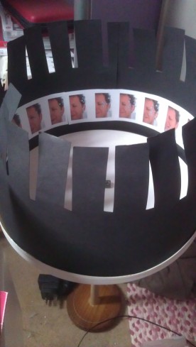
My traditional zoetrope:

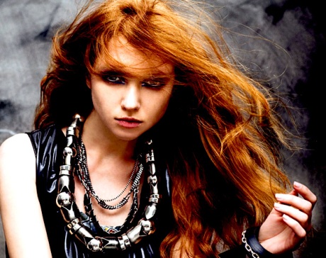
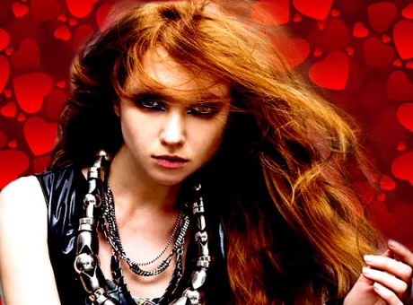
To create the pictures I used myself as the model, only showing half of my face, as to allow a closer zoom for more detail.  I then shot images of water droplets falling from a tap and altered the hue and saturation elements within Photoshop to create a higher contrast between the intended ‘tears’ and myself.  When it came to making my traditional zoetrope however, I realised that I had used too many images and the size of them did not hold the desired effect when rotated.  This is a bit of a disappointment as so much time was spent measuring and constructing it.  It is all a learning curve though, and from not knowing what a gif file was at the beginning of this module, to discussing it at length and producing animated sequences with them, I feel I have come a long way.

On to the book cover.

Not realising how my statement of intent was not entirely, realistically feasible within the time frame and availability of set ups, I have had to alter certain factors within.  These being things such as my models, due to other commitments, my set up (as I intended to shoot everything seperately and edit them together in Photoshop) and my book size.

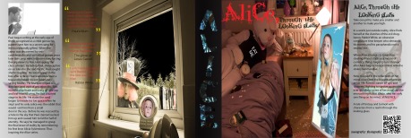
I know now that I over complicated what should have been a more simplistic book cover.  Although the back cover and inserts were adhered to a little more strictly, and I am satisfied with the result, it is more the front cover I had concerns with: The image is quite cluttered and has too much going on, drawing attention away from Alice, who has been cropped into a picture frame to resemble being trapped in a mirror.  The smaller details, such as the pills on the floor and the supposed line of drugs on the hand mirror can be difficult to see.  Also, I would have liked the rabbit costume to have been a little scarier, these are hard to come by, however.

I enjoyed the production of the book cover; setting out the guides and watching the overall design take shape, it is just that if I was to have another attempt I would definately allocate more time to the shoot, as opposed to leaving it until everything else had been finished and believing it would all go smoothly.

A successful outcome to the module upon handing in, in terms of realising the work involved in design and organisation of two seperate production assignments and the issues that can, and will arise in actual client-orientated situations.  Allowing enough time for each element of a set task is essential and ensuring that there is enough time to correct any overlooked errors (such as not putting the authors name on the front cover, as I have just become aware of with my own cover) or printing mistakes is key.
In class we have been using Dreamweaver to learn about the techniques involved in constructing a website.  We have discussed CSS ‘styles’, Hyper Text Markup Link (html, a digital version of a designer sending information to print about how font and imaging is to be displayed) and including your own work in a web template.  I am finding this very interesting and intend to explore this digital design avenue further over Summer.

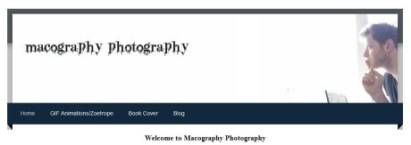
Below are extracts from a website I created using a template from ‘weebly.com’.  The website’s address is http://macography.weebly.com or refer to the QR Code at the bottom of this post.

Displaying my chosen website site name as a header on all pages that can be accessed by single clicking and of the links including in the header design.

Inclusion of a link, appropriately placed within text referring to the page the link navigates to.

Customised further with the use of a Facebook ‘Like’ button to generate publicity and awareness of the website.  I obtained this feature from Facebook’s ‘Developers’ page on their website using their ‘iframe’ capability.  The link is active and when clicked, will post a link of the website to the person’s Facebook news feed.

macography photography

image

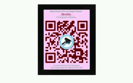
A flyer I have created using a QR Code as the main advertising theme.  This is a fully working link to the logo I have placed in the centre.  Having researched QR Hacking I learnt that, depending on the size of the code, a certain percentage of pixels are not used, making it possible to either manipulate them or place a picture over the top of them.  I acquired the logo from the West Yorkshire Print Workshop site, which is what they use to present their business, publicly, according to their website in February 2012.

A little research regarding the alternative and traditional styles of Alice in Wonderland book covers from past to present.  I have sifted through a great number of book covers from various websites, some legitimately published and some the imaginative creations of design/art students and hobbyists.  From these I have chosen a few images (annotated below) that hold certain characteristics relevent to my own work.

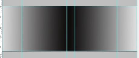
I have already measured the book I intend to use for my dust jacket cover.  I have measured it and produced a template using Photoshop, I will use it for reference when placing my images in the required, pre-sized positions.  Please note that I have chosen a book that has a landscape orientation as to house my intended landscape orientated pictures.  The cover will have to be printed using A1 sized paper for issues regarding length:

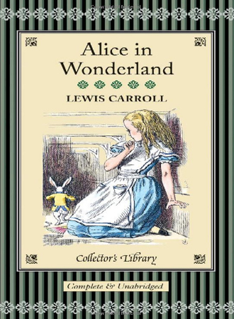
Firstly, we have a traditional drawing depicting an innocent looking young girl taken aback by a smartly dressed rabbit seeminly sneaking off into a small hall/doorway.  Alice is dressed in old style girls clothing apt to the Victorion era in the original blue and white colours she is famous for.  My image will relate to this due mainly due to the colour of the clothing and the inclusion of a rabbit.

Lewis Carroll

http://forbookssake.net/2010/09/27/banned-books-alice-in-wonderland-by-lewis-carroll/  [accessed: 02/2012]

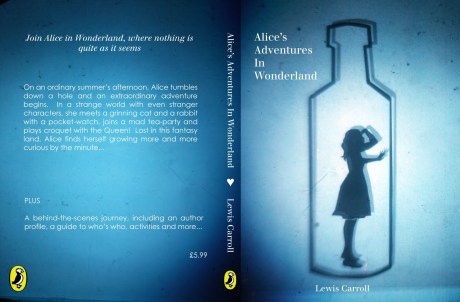
From a designers P.O.V this is a simplistic idea where Alice is sillouhetted and trapped in a bottle, using deep blues around the edges of the book cover and blowing out to a white light behind the main focal point.  Similar to my idea is the implication of being trapped.

Jill Patterson

http://www.google.co.uk/imgres?q=alice+in+wonderland+book+cover&um=1&hl=en&tbm=isch&tbnid=ZnoHU2GwMHEx6M:&imgrefurl=http://jillpatterson.blogspot.com/2010/06/alice-in-wonderland-childrens-book.html&docid=eJrOISYHhuQXWM&imgurl=http://3.bp.blogspot.com/_6bUM7rbGKDE/TCUHhquVdVI/AAAAAAAAAG8/xCKmstuv6jU/s1600/ALICEfinalBLUE.jpg&w=1600&h=1051&ei=GhcxT566OMjR8QPu1tjpBg&zoom=1&iact=hc&vpx=181&vpy=288&dur=427&hovh=182&hovw=277&tx=138&ty=80&sig=116575248122263253320&page=2&tbnh=147&tbnw=202&start=30&ndsp=33&ved=1t:429,r:13,s:30&biw=1280&bih=823 [accessed:02/2012]

Very chaotic, very scattered, much going on throughout the whole frame.  Unusual choice of colour.  Not very relevent to my final image aside from the fact that there is a lot going on based around one main focus, which although rather messy, has quite an interesting effect.

sophira-moonlily

http://sophira-moonlily.deviantart.com/art/Alice-in-wonderland-book-cover-186495571 (02/2012)

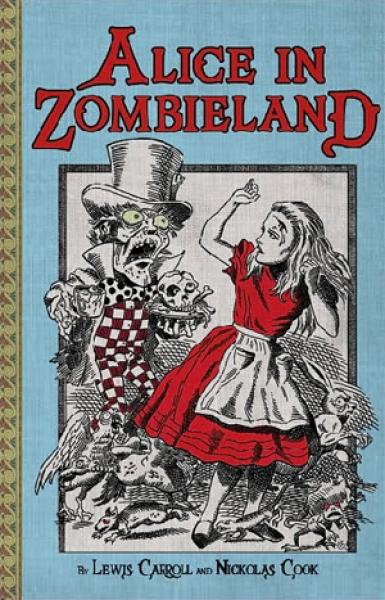
Slightly more quirky; we see Alice being placed in a compromising situation, under direct attack from a zombie-fied Mad-Hatter.  Use of black and white with red attire and font creates a unique approach whilst making the focus points stand out, still maintaining the essence of Alice in Wonderland. The unique eccentricity and controversial aspects are what are also (hopefully) portrayed in my book cover.

Nikolas Cook

http://www.google.co.uk/imgres?q=alice+in+wonderland+book+cover&um=1&hl=en&tbm=isch&tbnid=k43u9cMsZYra3M:&imgrefurl=http://fuckyeahbookarts.tumblr.com/post/13778040155/eckstatic-awesome-just-awesome&docid=Up3MhBE9JOCqxM&imgurl=http://26.media.tumblr.com/tumblr_li2wo0y8Dm1qalrogo1_400.jpg&w=385&h=600&ei=GhcxT566OMjR8QPu1tjpBg&zoom=1&iact=hc&vpx=317&vpy=400&dur=7265&hovh=280&hovw=180&tx=105&ty=116&sig=116575248122263253320&page=7&tbnh=150&tbnw=96&start=195&ndsp=33&ved=1t:429,r:1,s:195&biw=1280&bih=823 [accessed: 02/2012]

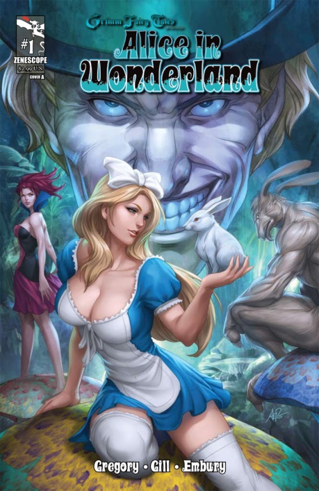
Beautifully illustrated cover, excellent use of shades and well presented with the colours mixing well.  Alice is portrayed in a very sexy way, kind to the animals and confident in herself.  The background is sinister and dark with the Mad-Hatter looming over her.  The implicit sexual nature carries over to my depiction of Alice and characters, however the rabbit will be the menacing inclusion, not the Mad-Hatter.

Zenescope / Brothers Grimm

http://www.google.co.uk/imgres?q=alice+in+wonderland+book+cover&um=1&hl=en&tbm=isch&tbnid=C29uxBQQZOQUXM:&imgrefurl=http://comicbuzz.com/zenescopes-alice-in-wonderland-1-sells-out&docid=XolpynU47wasfM&imgurl=http://comicbuzz.com/files/2012/01/Alice01-cover.jpg&w=700&h=1076&ei=GhcxT566OMjR8QPu1tjpBg&zoom=1&biw=1280&bih=823&iact=rc&dur=224&sig=116575248122263253320&page=5&tbnh=154&tbnw=100&start=128&ndsp=32&ved=1t:429,r:27,s:128&tx=39&ty=76 [accessed: 02/2012]

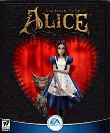
Dark, mysterious and connatations of evil with colours to match.  I like the fact that Alice is not the usual innocent person she is generally portrayed as, along with the Chesire cat being her skeletal accomplice.  Dark and sinister insinuation can also be found in my book cover.

American McGee

http://www.google.co.uk/imgres?q=american+mcgee%27s+alice&um=1&hl=en&tbm=isch&tbnid=JT7kFI8gexI0GM:&imgrefurl=http://www.amazon.co.uk/Aspyr-American-McGees-Alice/dp/B00005YT4E&docid=8lbUOS4QrkanOM&imgurl=http://ecx.images-amazon.com/images/I/51B0RWYKEML._SL500_AA300_.jpg&w=300&h=300&ei=lz8xT4mMLoiB8gPP5NH-Bg&zoom=1&biw=1280&bih=820&iact=rc&dur=70&sig=116575248122263253320&page=1&tbnh=132&tbnw=133&start=0&ndsp=25&ved=1t:429,r:1,s:0&tx=74&ty=16 [accessed: 02/2012]

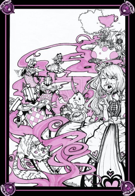
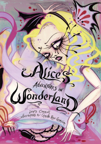
Quite messy, abstract style portrait of Alice looking quite upset and bewildered.  Smudged makeup and an upset appearence is what I like most about this cover and what is being incorporated into my dust jacket.

Camille Rose Garcia

http://buzzworthy.mtv.com/2010/03/01/buzzworthy-style-files-top-5-alice-in-wonderland-inspired-items/ (02/2012)


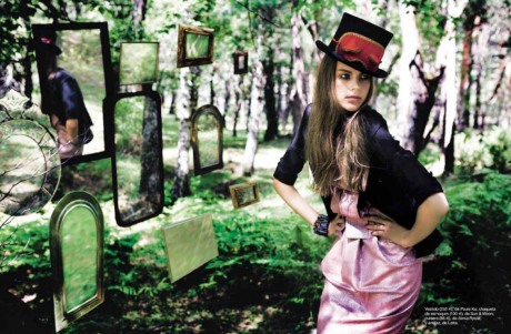
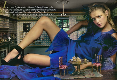
Please see below for photography inspired ‘Alice’ book covers:


Ragazza magazine [accessed 03/2012]


annie leibovitz [accessed 03/2012]

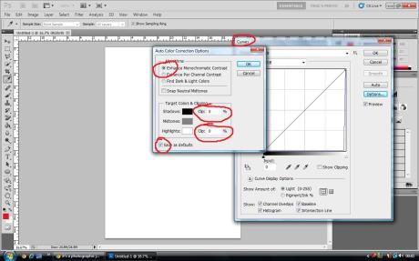
As Photoshop is primarily a tool used by designers it is not precisely set for use by photographers.  There are a couple of simple things that can easily be adjusted however, to have a default setup that accommodates professional photography.  These settings consist of:

Curves:

Adjustments > Curves > Set both Clipping percentages to 0%.

Also click the ‘Enhance Monochromatic Contrast’ options and then ‘Save as default’.  This will prevent Photoshop from throwing away shadow and highlight information that could differentiate a masterpiece from an image that gets deleted.

There are also measurements that can be calculated to provide a more accurate visualisation within viewing ‘Print Size’.  To do this simply measure the width of the monitors resolution pixels by the width of the monitor itself, and divide, thus giving the correct Pixels Per Inch (ppi)

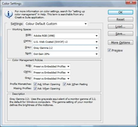
Finally, a quick reference concerning colour space:

sRGB – good for websites such as files saved as giff’s that work with a lower degree of colour space.  We can use the Jpeg slider to reduce the image file size when saving ‘Save to Web and Devices’ to assist web pages in accommodating such files.

Adobe RGB – A higher quality colour space than sRGB, good for printing, such as in an editorial locale.

Pro Photo – Super high quality printing, presumably for printing A2 or larger; medium and large format printing.

These settings can be amended according to the project at hand using:

Edit > Colour Settings (As below)

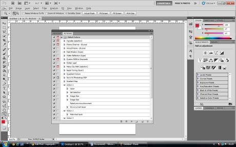
Another interesting feature of Photoshop, that I found quite fascinating, is the Actions tool.  Using Windows > Actions activates the utility box displayed below, with this you can record a number of actions within a task (as many as is beneficial to yourself) and play them back to have Photoshop cutout otherwise repetative, time consuming, monotonous tasks.  Brilliant.  In the case of a series of files or folders where the same actions need to be undertaken in bulk, there is the option of recording through ‘Actions’ then selecting File > Automate > Batch: Job done.

Just a quick blog to include the generation of my QR code (below), created using the QR Code Generator at ‘http://qrcode.kaywa.com/‘:

Myself, and others will now be able to use this code to access this blog using the process of Synergy; the interaction of technology/applications/different types of media with each other.  For example, using a smart phone with a QR code scanner to link to this blog which was created, and is monitored and updated primarily via a laptop.

A QR code (Quick Response Code) is much the modern version of a Barcode, but with the capability to store much more information and be more interactive and useful with progressing technology, including augmented reality, where, when scanned, you can actually move the scanner around to reveal the link (such as a picture) with the potential to move the device around and look around the link.

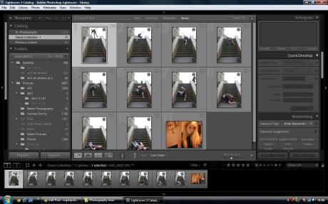
Below is a link to my Lightroom Slideshow example.  For this I photographed a series of images and brought them together with the theme ‘Falling’.  The soundtrack is also called ‘Falling’, by Alicia Keys as is apt to the theme.  I used the options panel in Lightroom to adjust my settings and tweek the image progression to my intended requirements, such as including an opening slide with my mock company name, followed by a picture of a girl to imply the physical act of falling is a metaphor for the emotional act of falling in love.  I was also able to alter background colours, borders, watermarks and the timing of the transitions within Lightroom.

http://www.youtube.com/watch?v=f3fXCyFHZZE&feature=youtu.be

Below is a setup of stills used and Lightroom controls I used to produce the above video:

As year progresses and the modules horizon becomes much more than just a distant landscape, wavering in the promised heat of Summer, I realise that I have still lots to do.

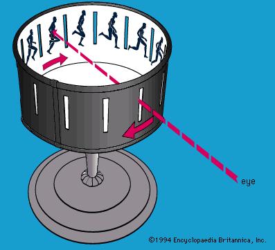
Adding to the book cover, of which I have found great inspiration from within (and from the link at the bottom of this screen), we have now to construct a zoetrope, this being a practical example of persistence of vision.  Traditionally, a slot would be made in a circular object that can rotate at varying speeds, and a sequence of images would be placed on the inside of this circle so that when viewed through the slot and rotated it would look very much like the examples in previous blogs demonstrating moving.  Examples such as those by Edweard Muybridge, and myself.  Please see Fig 1:


Image taken from, http://library.thinkquest.org, Jan 2012.

Alternatively, a zoetrope can be created digitally by using similar methods to the GIFF files shown in previous blogs.

Originally, I had intended to create a digital zoetrope, but having already experimented with GIFF’s and intending to create many more (hopefully more advanced GIFF’s) in my spare time, I thought I would take to some craft and produce a traditional one.

So, as for my book cover, I am currently in the process of gathering the required materials and accessories I will need for both my model and the set.  This should take the maximum of a week to do, then I can move onto taking test shots in the studio to acquire the correct lighting, composition and also help to assist me in deciding whether or not to remove certain items that may clutter the scene and possibly divert attention from the main focal point(s).

Although I have come to realise that my final picture is going to be more complicated than I had originally assumed (even then I knew it wasn’t going to be straight forward), I am persistent in sticking with the theme and carrying out everything necessary to fulfill the specification and requirements of my Statement of Intent.  Therefore, at this point, I do not intend to change anything from my originally conceived take on the stories dust jacket.

This may take more time and effort than I had orignally penciled in for, however I believe it will be a good experience and enjoyable throughout.  Though if the set-ups and final pieces of my future assignments are based around a simpler concept, then you know why.

Link to inspiration and information gathering for a book cover shoot:

http://www.youtube.com/watch?v=zdmdYuuA91U&feature=mfu_in_order&list=UL

Refining the edges of a cut away in Photoshop can be a tricky proceedure, but with time and effort, and definitely patience, the results can be very worthwhile.  Especially so if you have work from clients, for example, who are relying on a job being completed to a  highly professional level.

In class I used a model for my example, either downloaded from usb stick or from the internet.  I then used the selection tools (mainly ‘polygonal lasso’ and the ‘quick selection’) to draw a rough outline of my model.  After this, I pasted my model onto a selected background (Fig 1 – Original Picture) (Fig 2 – Model on new background) and then undertook the more pain-staking process of finely selecting the edges of the models hair (which, as you will see, was not the easiest of tasks), cutting in slightly as not to retain any unwanted, original background, again using the ‘polygonal lasso’ selection tool.

When this was complete I made sure any selection tool was selected, then opened the ‘Refine Edge’ tool box.  Here I am presented with a variety of options to help me fine tune my image to gain the desired effect and help give the impression that the model fits comfortable with the background.

I used feathering and softening to smooth out the edges of the ends of the models hair and the brush tool to create a more seamless blend of model and environment.  The radius tool assisted in this and the decontaminate colours option helped to clear up the less noticeable influences of background colour that had leaked onto the model.

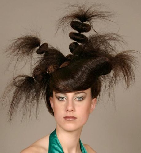
Fig 1 – Original Picture: sourced from http://www.motherguide.com

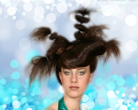
Fig 2 – Model on new background:

I had another go later with a different model with the following results:

Fig 3 – New Model (Original Image): sourced from http://www.barbiemakeupblog.blogspot.com

Fig 4 – New Model (On New Background):

As I review these blogs and update when I feel necessary, continuing examples may appear below.  Hopefully showing improvement.

Fig 5 – Picture of a model whose hair I intended to use on an image of myself:


Fig 6 – Altered image of myself with my hair (most of my hair) erased using the clone tool and the hair from Fig 5 scaled, skewed (using Edit, Transform) and placed appropriately:


Fig 7 – Original, unedited version of Fig 6:

Today we looked at Persistence of Vision (POV) and Convergence.  POV is the generally encouraged theory that the eye retains some information from what we have just previously seen and merges it together, seamlessly with what we are currently seeing, hence how we perceive moving images or movies.  Below are two examples of POV:

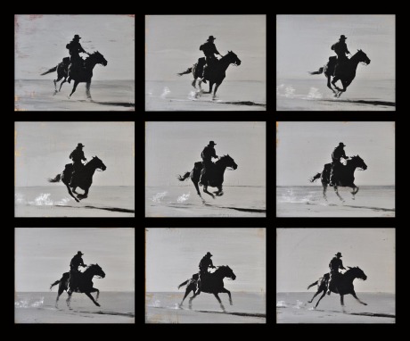
This is a series of images Eadweard Muybridge (who proved the theory that horses completely leave the ground whilst running) used.  I used the rectangular selection tool in Photoshop to copy each image on to seperate layers, then set the transition time and saved the following series as a GIFF file using the ‘Animation’ tool in order to view the progession of the images on the internet:

Here is another example using the same technique but a bit larger and clearer.  I will also note that when saving the image as a GIFF file I reduced the RGB (or in this case, monochrome) in order to reduce the file size, but not necessarily noticeably reducing the quality (Image by Gordon McConnell, taken from http://www.brogallery.com/artists-links/gordon-mcconnell/ :

And the POV:

Convergence

Convergence is the coming together of technologies.  For example, in the case of DSLR’s, convergence is the ability to shoot film on a predominantly still frame camera.  Below is an example of a movie created on a still frame camera (Canon EOS 5d Mark II), a beautiful example of convergence, especially with the narrow depth of field achieved via the full frame sensor:

http://www.youtube.com/watch?v=ANav_t1EMgw&feature=results_main&playnext=1&list=PLAAD737E5986F0957

Below is another example of a Persistence of Vision that I saved as a GIFF file.  Something put together for a bit of fun and creative outlet:

I used images from the web to construct individual layers on photoshop and carefully put them into a sequence where the unassuming cow is abducted by quick ‘pass-and-grab’ alien kidnappers.